
ChatGPT-4o
Food & Culinary
Published Nov 5, 2026
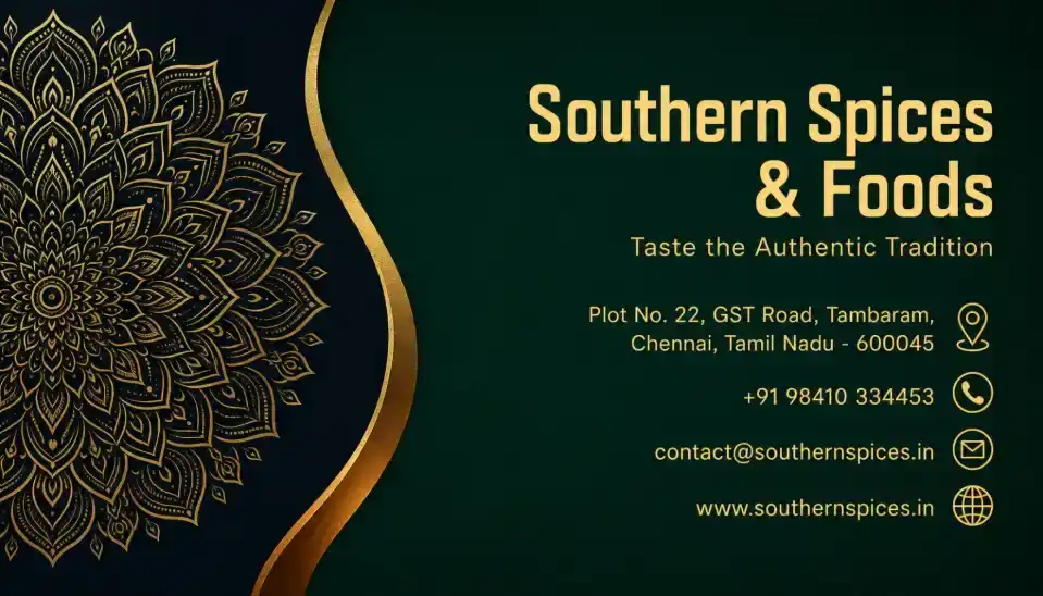
Food & Spices Business Visiting Card
Create a polished NORMAL/FREE single-sided visiting-card image using the complete design specification below

Ai Prompt Labs
@admin • Prompt Engineer
Prompt Instruction Payload
Create a polished NORMAL/FREE single-sided visiting-card image using the complete design specification below.
IMPORTANT:
This is a customer-facing IMAGE GENERATION prompt.
Before generating the visiting card, first ask me ONLY for the business information required by this specific design. After I provide the available details, immediately generate the final visiting-card image.
Do not ask unnecessary questions.
Do not wait for optional information.
Never invent, guess, autocomplete, or substitute missing business information.
STEP 1 — ASK ME ONLY FOR THESE DETAILS
Ask me for:
1. Company / Brand Name
2. Tagline / Slogan — optional
3. Business Address — optional
4. Phone Number — optional
5. Email Address — optional
6. Website — optional
Do not ask for:
- person name
- designation
- social media
- QR code
- second phone number
- registration number
- GST number
- profile photo
- any other information not used by this specific card design
MISSING-INFORMATION RULE — VERY IMPORTANT
Use ONLY the information I actually provide.
If I answer “no,” “skip,” “none,” leave a field unanswered, or do not provide a detail:
- remove that entire text row from the card
- remove its corresponding icon
- do not leave a placeholder
- do not leave a dash
- do not leave an empty icon
- do not leave an obvious blank row
- do not reserve visible space for that missing detail
- naturally rebalance the remaining content vertically so the design still looks intentional and professionally composed
For example:
- no website = no website text and no website/globe icon
- no email = no email text and no email icon
- no phone = no phone text and no phone icon
- no address = no address text and no location icon
- no tagline = remove the tagline line completely and tighten the spacing naturally
Never invent contact information to fill empty areas.
After receiving my available information, immediately generate the final visiting-card image according to the following design.
CARD FORMAT
Create ONE single-sided horizontal visiting card.
Aspect ratio: exact 7:4.
Orientation: horizontal landscape.
Presentation: flat, straight-on, edge-to-edge finished visiting-card artwork.
Fill the complete image with the card design from edge to edge.
Do not show white margins around the card.
Do not create a floating card mockup.
Do not create a desk scene, hand-held card, perspective view, angled card, shadows outside the card, or multiple cards.
The final output must look like a complete print-ready visiting-card face.
OVERALL VISUAL DIRECTION
Create an elegant, premium-looking corporate card with a dark luxury palette inspired by deep forest green, near-black navy, metallic gold, and warm muted gold typography.
The card should feel:
- sophisticated
- international
- trustworthy
- refined
- upscale
- corporate
- elegant
- clean
- visually balanced
Even though this is a Normal/Free version, make the execution highly polished and professional without adding unnecessary complexity.
BACKGROUND
Use a rich, dark teal-green background across most of the card.
Suggested appearance:
- deep forest green / dark emerald teal
- subtle smooth tonal depth
- very soft vignette toward the edges
- no visible noisy texture
- no obvious gradient bands
- no distracting patterns behind the information
The overall background should remain dark enough to create excellent contrast with the gold typography and decorative elements.
LEFT DECORATIVE SECTION
Reserve approximately the left 30–35% of the card for a decorative luxury motif.
Create a large intricate ornamental mandala pattern entering from the left side.
The mandala should:
- be partially cropped by the left edge
- extend from near the top-left toward the lower-left region
- contain detailed radial floral, leaf, geometric, and lace-like line work
- use thin metallic-gold lines
- feel elegant and symmetrical
- remain decorative rather than visually dominant
- not contain readable text
- not look like a religious symbol
- not resemble a logo unless the user explicitly supplies one
Use a dark near-black/navy section behind the mandala so the gold pattern has strong contrast.
Do not make the mandala oversized enough to interfere with the business information.
GOLD CURVED DIVIDER
Create a sweeping curved divider separating the ornamental left section from the information area.
The curve should:
- begin near the upper-center-left
- sweep inward with an elegant S-like contour
- continue downward toward the lower-left-center
- create a smooth flowing transition between the two visual zones
Use a metallic-gold main edge with a realistic warm-gold appearance.
Add a subtle secondary warm bronze or amber highlight along part of the lower curve to create visual depth.
The effect should look like a refined printed metallic accent, not like thick plastic, chrome tubing, or a 3D object.
Keep the divider narrow and elegant.
RIGHT-SIDE INFORMATION AREA
Use the right 60–65% of the card for all business information.
Keep all content safely inside the card boundaries with comfortable margins.
Use a clean right-aligned composition similar to an upscale corporate identity card.
The text zone should have strong hierarchy and generous vertical spacing.
COMPANY / BRAND NAME
Place the company or brand name prominently near the upper-right area.
Use uppercase styling if appropriate for the supplied name.
Typography:
- clean geometric sans-serif
- bold or semi-bold
- strong professional presence
- slightly increased letter spacing
- warm metallic-gold / champagne-gold color
- crisp edges
- excellent legibility
If the company name naturally contains multiple words, allow it to wrap elegantly into two lines if this improves balance.
Do not unnecessarily distort, abbreviate, or restyle the supplied name.
Reproduce the supplied company name EXACTLY.
TAGLINE
If a tagline is supplied, place it directly below the company name.
Use:
- smaller size
- regular or light sans-serif
- refined muted-gold color
- good tracking
- balanced line spacing
Keep it elegant and secondary to the company name.
Reproduce the supplied tagline exactly, including punctuation and capitalization.
If no tagline is supplied, remove this line completely.
CONTACT INFORMATION
Arrange the provided contact details in a clean vertical stack below the brand section.
Preferred order when available:
1. Address
2. Phone
3. Email
4. Website
Each row should contain:
- the exact supplied information
- one small relevant icon positioned to the far right of that row
Use consistent alignment across all rows.
TEXT STYLE
Contact text:
- clean modern sans-serif
- medium-small readable size
- muted antique-gold or warm gold
- regular font weight
- strong contrast against the dark green background
- no overly condensed font
- no decorative script
Keep the information readable at visiting-card size.
ICONS
Use small, clean, circular or minimal line-style gold icons.
Suggested icons:
- Address → location pin
- Phone → telephone handset
- Email → envelope
- Website → globe or simple web symbol
Icon style must be consistent.
Use:
- warm gold color
- minimal detailing
- compact size
- equal visual weight
- precise vertical alignment with its text row
Do not use oversized icons.
Do not add an icon for a field that the user did not provide.
If a field is missing, remove BOTH its text and its icon.
LAYOUT AND SPACING
Maintain a refined information hierarchy:
Primary:
Company / Brand Name
Secondary:
Tagline
Tertiary:
Address, phone, email, website
Use intentional negative space.
Do not cram the card.
If fewer contact fields are provided, redistribute the remaining content naturally rather than leaving awkward empty rows.
Keep the brand block in the upper-right region and contact rows around the middle-to-lower-right region.
Maintain clear separation between the left decorative motif and the right information content.
COLOR SYSTEM
Use approximately:
Background:
deep forest green / dark emerald teal
Decorative left zone:
near-black navy or extremely dark teal
Main metallic accent:
warm rich gold
Secondary curve highlight:
subtle bronze / amber gold
Primary brand text:
warm champagne gold
Secondary/contact text:
soft muted antique gold
Avoid:
- bright yellow
- neon gold
- orange-heavy gold
- pure white text unless absolutely necessary
- bright green
- blue
- purple
- random accent colors
TYPOGRAPHY QUALITY
Typography is extremely important.
Ensure:
- exact spelling
- exact capitalization
- exact punctuation
- correct phone formatting
- correct email spelling
- correct website/domain spelling
- clean kerning
- consistent baselines
- adequate line spacing
- no gibberish
- no malformed letters
- no duplicated characters
- no missing text
- no random filler text
- no fake company information
Never replace supplied words with visually similar but incorrect text.
Do not change the user's company name, tagline, address, phone number, email, or website.
PRINT AND RENDER QUALITY
Generate the card as:
- sharp
- high resolution
- professional
- print-quality
- clean-edged
- visually balanced
- realistic metallic-gold effect
- smooth background
- crisp ornamental details
- crisp typography
The card should feel like professionally designed corporate stationery rather than an AI-generated poster.
NEGATIVE CONSTRAINTS
Do NOT generate:
- square card
- portrait card
- flyer
- poster
- brochure
- folded card
- vertical orientation
- wrong aspect ratio
- 3D mockup
- desk mockup
- card held in hands
- card lying on a table
- perspective distortion
- multiple cards
- front/back sheet
- QR code
- social-media icons unless explicitly requested
- invented logo
- random initials
- fake data
- placeholder text
- lorem ipsum
- extra business information
- watermark
- stock-photo watermark
- unnecessary border
- excessive glow
- thick bevel effects
- plastic-looking gold
- chrome-like metal
- oversized mandala
- text over the mandala
- unreadably ti
Insert discreet watermark in the lower right corner of the image, vertical text (rotated 90°), written "aipromptlabs.online", Calibri Light font, white color with low opacity (semi-transparent), medium size. Extreme sharpness on the face, fabric texture and typography of the letters. Shot on Canon EOS R5, 50mm f/2.8, studio light.
ChatGPT-4o
Midjourney v6.1
ChatGPT-4o

Midjourney v6.1
Midjourney v6.1

Creator Discussions & Community Comments 0
Join the AI Prompt Labs community to comment and share variations.